I want to study Excess rentals in TfL bike sharing. First get the data on how many bikes getting hired every single day. We can get the latest data by running the following codes:
url <- "https://data.london.gov.uk/download/number-bicycle-hires/ac29363e-e0cb-47cc-a97a-e216d900a6b0/tfl-daily-cycle-hires.xlsx"

# Download TFL data to temporary file
httr::GET(url, write_disk(bike.temp <- tempfile(fileext = ".xlsx")))
## Response [https://airdrive-secure.s3-eu-west-1.amazonaws.com/london/dataset/number-bicycle-hires/2021-09-23T12%3A52%3A20/tfl-daily-cycle-hires.xlsx?X-Amz-Algorithm=AWS4-HMAC-SHA256&X-Amz-Credential=AKIAJJDIMAIVZJDICKHA%2F20211019%2Feu-west-1%2Fs3%2Faws4_request&X-Amz-Date=20211019T093128Z&X-Amz-Expires=300&X-Amz-Signature=757cf52cad4b0585a8e8c85955a7a9c4e50fe27df85e329626695d0abf891c07&X-Amz-SignedHeaders=host]
## Date: 2021-10-19 09:31
## Status: 200
## Content-Type: application/vnd.openxmlformats-officedocument.spreadsheetml.sheet
## Size: 174 kB
## <ON DISK> C:\Users\lenovo\AppData\Local\Temp\RtmpMBxQ5N\file892c703b1506.xlsx# Use read_excel to read it as dataframe
bike0 <- read_excel(bike.temp, sheet = "Data", range = cell_cols("A:B"))
# change dates to get year, month, and week
bike <- bike0 %>%
clean_names() %>%
rename(bikes_hired = number_of_bicycle_hires) %>%
mutate(year = year(day), month = lubridate::month(day, label = TRUE), week = isoweek(day))We can easily create a facet grid that plots bikes hired by month and year.
The distributions of bikes hired per month during May and Jun in 2020 is flatter compared with that of the previous years. The standard deviations of May and June, 2020, are also higher than the previous years, reflecting the fact that there more variations among days when very few bikes were rented and days when lots of bikes were rented. This wide dispersion is the evidence of Covid-19’s significant affect and restrictionson on people’s daily travel.
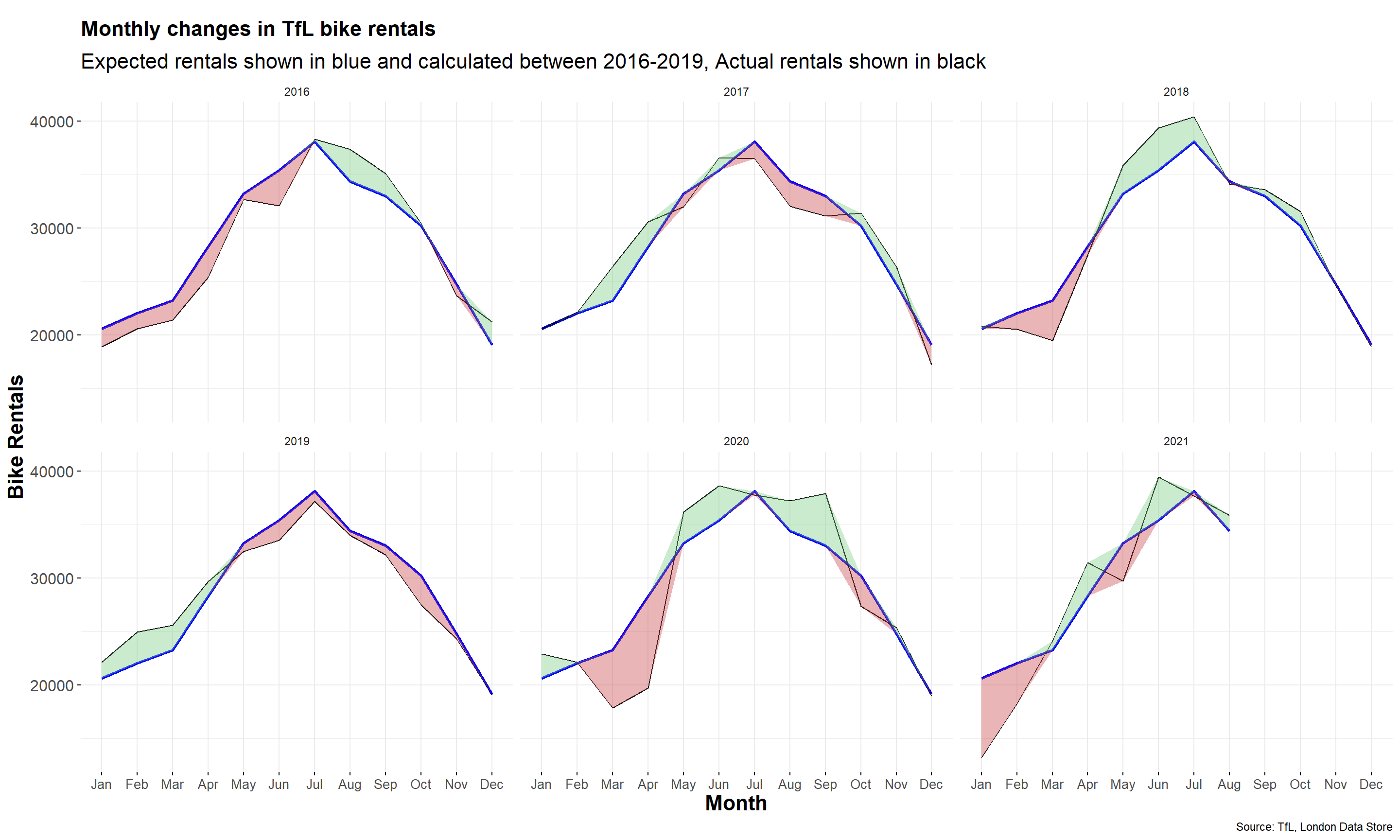
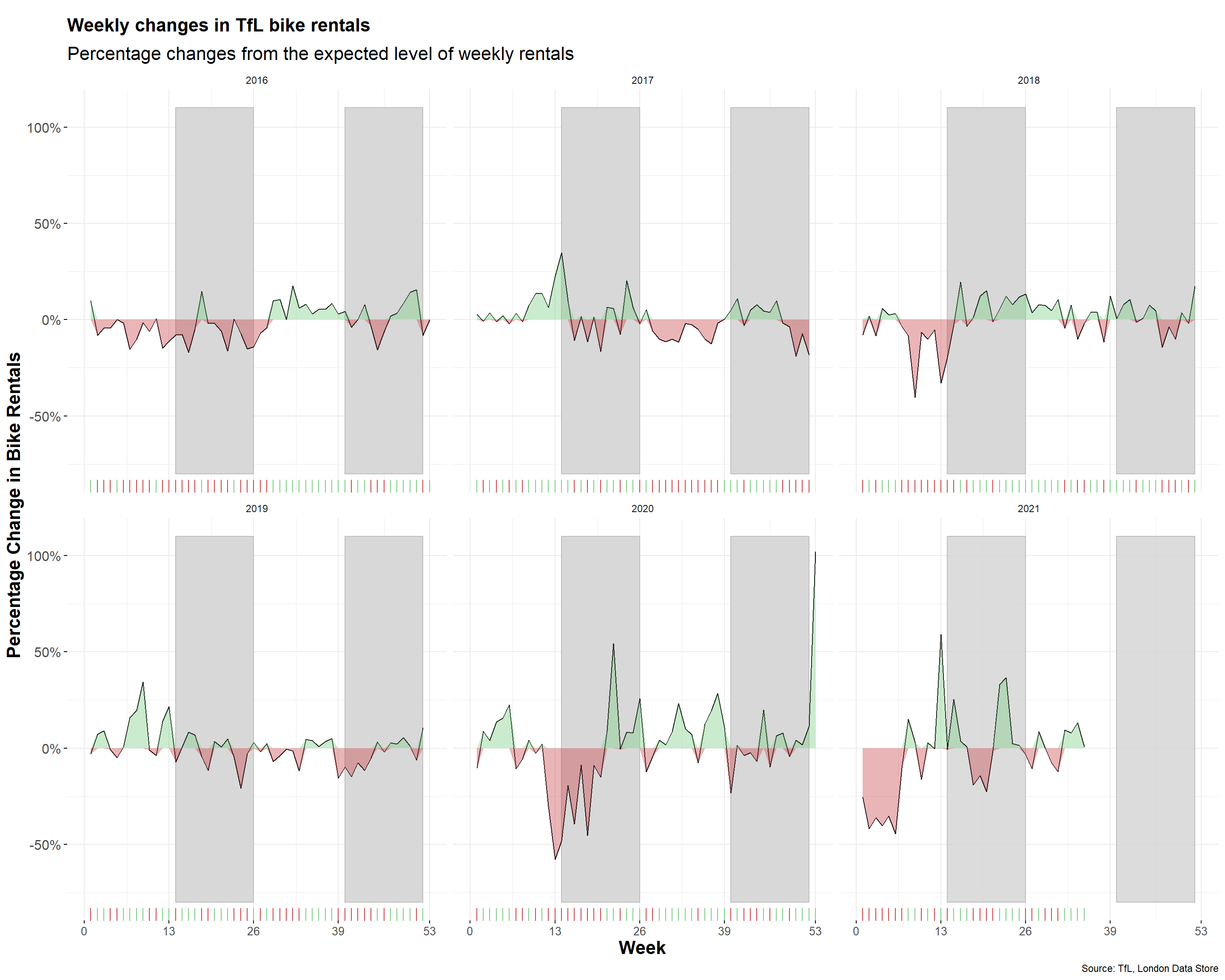
We then start to reproduce the following two graphs:
Monthly changes in TFL bike rentals between 2016 and 2019
TFL bike rentals’ weekly percentage changes from the expected rentals between 2016 and 2019. The two grey shaded rectangles correspond to Q2 (weeks 14-26) and Q4 (weeks 40-52).
For both of these graphs, we calculate the expected number of rentals per week or month between 2016-2019, and then see how each week/month of 2020-2021 compares to the expected rentals, using the calculation excess_rentals = actual_rentals - expected_rentals.
The mean of the number of bicycle hired is used to calculate the expected rentals, as mean takes the whole dataset into consideration and reprsents the average of the entire data.
Additionally, we uses these links as references when creating plots:
- https://ggplot2.tidyverse.org/reference/geom_ribbon.html
- https://ggplot2.tidyverse.org/reference/geom_tile.html
- https://ggplot2.tidyverse.org/reference/geom_rug.html
Monthly bike rental change
We first calculate the mean of monthly number of bicycles hired between 2016 and 2019, and then get the monthly changes in TFL bike rentals using excess_rental method. We set “up” for the positive excess rental (when monthly actual_rentals is greater than expected_rentals), and “down” for the negative excess rental (when monthly actual_rentals is less than expected_rentals).
bike_month_16_19 <- bike %>%
  filter(year>=2016&year<=2019)%>%
  group_by(month) %>%
  summarise(expected_rental=mean(bikes_hired))


bike_month <- bike %>%
  filter(year>=2016) %>%
  group_by(year,month) %>%
  summarise(bike_hired_month=mean(bikes_hired),.groups = 'drop')

bike_month_comp <- merge(bike_month,bike_month_16_19,by="month") %>%
  mutate(excess_rentals = bike_hired_month - expected_rental,
         up = ifelse(bike_hired_month>expected_rental, excess_rentals, 0), #up gives the diffrence between actual and expected rentals when actual>expected
         down = ifelse(bike_hired_month<expected_rental, excess_rentals, 0)) #down gives the diffrence between actual and expected rentals when actual<expected
Then we use geom_line and geom_ribbon to generate the lines for expected rental. The green area represents the rental changes where the actual monthly number of bicycles hired is greater than the expected rental, and the red area appears when the actual monthly number of bicycles hired is less than the expected rental. The plots of monthly changes in Tfl bike rentals between 2016 and 2019 are illustrated below:
ggplot(bike_month_comp,aes(month))+
  geom_line(aes(x=month,y=expected_rental,colour="Expected",group=year),size=1)+
  geom_line(aes(x=month,y=bike_hired_month,colour="Actual",group=year))+
  geom_ribbon(aes(ymin=expected_rental,
                  ymax=expected_rental+up,group=year),alpha=0.4,fill="#7DCD85")+ #plot the areas in green using up when actual>expected
  geom_ribbon(aes(ymin=expected_rental+down,
                  ymax=expected_rental,group=year),alpha=0.4,fill="#CB454A")+ #plot the areas in red when using down actual>expected
  scale_colour_manual("",breaks=c("Expected","Actual"),values=c("blue","black"))+
  facet_wrap(~year)+
  theme_minimal()  +
  theme(legend.position = "none",
        plot.title =element_text(size=16, face='bold',hjust = 0,margin = margin(10,0,10,0)),
        plot.subtitle =element_text(size=16, hjust = 0), #put titles in the middle
        axis.text.x = element_text(size=10),
        axis.text.y = element_text(size=12),
        axis.ticks.x = element_line(),
        axis.ticks.y=element_line(),
        axis.title.x = element_text(size=16,face='bold'),
        axis.title.y = element_text(size=16,face='bold'),
        ) +
  labs(title = "Monthly changes in TfL bike rentals",
       subtitle = "Expected rentals shown in blue and calculated between 2016-2019, Actual rentals shown in black",
       caption= "Source: TfL, London Data Store",
x="Month", y="Bike Rentals") 
Weekly percentage change of bike
We then calculate the mean of weekly number of bicycles hired, and the weekly percentage change between actual and expected bike rentals between 2016 and 2019. We set “up” for the positive percentage change (when weekly actual_rentals is greater than expected_rentals), and “down” for the negative percentage change (when weekly actual_rentals is less than expected_rentals).
glimpse(bike)## Rows: 4,051
## Columns: 5
## $ day <dttm> 2010-07-30, 2010-07-31, 2010-08-01, 2010-08-02, 2010-08-0~
## $ bikes_hired <dbl> 6897, 5564, 4303, 6642, 7966, 7893, 8724, 9797, 6631, 7864~
## $ year <dbl> 2010, 2010, 2010, 2010, 2010, 2010, 2010, 2010, 2010, 2010~
## $ month <ord> Jul, Jul, Aug, Aug, Aug, Aug, Aug, Aug, Aug, Aug, Aug, Aug~
## $ week <dbl> 30, 30, 30, 31, 31, 31, 31, 31, 31, 31, 32, 32, 32, 32, 32~bike_week_16_19 <- bike %>%
filter(year>=2016&year<=2019)%>%
group_by(week) %>%
summarise(expected_rental=mean(bikes_hired))
bike_week <- bike %>%
filter(year>=2016) %>%
filter(!(year==2021&week==53))%>%
group_by(year,week) %>%
summarise(bike_hired_week=mean(bikes_hired),.groups = 'drop')
bike_week_comp <- merge(bike_week,bike_week_16_19,by="week") %>%
mutate(percentage_rentals_change = (bike_hired_week - expected_rental)/expected_rental,
up = ifelse(bike_hired_week>expected_rental, percentage_rentals_change, 0), #up gives the percentage diffrence between actual and expected rentals when actual>expected
down = ifelse(bike_hired_week<expected_rental, percentage_rentals_change, 0)) #down gives the percentage diffrence between actual and expected rentals when actual<expectedThe two grey shaded rectangles correspond to Q2 (weeks 14-26) and Q4 (weeks 40-52) are also added.
ggplot(bike_week_comp,aes(week))+
  geom_rect(aes(xmin=14,xmax=26,ymin=-0.8,ymax=1.1,group=year),colour="grey",alpha=0.002)+ #plot rectangles for Q2
  geom_rect(aes(xmin=40,xmax=52,ymin=-0.8,ymax=1.1,group=year),colour="grey",alpha=0.002)+ #plot rectangles for Q4
  geom_rug(aes(colour=ifelse(bike_hired_week>=expected_rental,">=0","<0")),sides="b")+ #plot rug for x asis
  scale_colour_manual(values=c("#CB454A","#7DCD85"),name="Actual vs Expected ", guide=FALSE)+
  geom_line(aes(x=week,y=percentage_rentals_change,group=year),colour="black",size=0.5)+
  geom_ribbon(aes(ymin=0,
                  ymax=up,group=year),alpha=0.4,fill="#7DCD85")+ #plot the areas in green using up when actual>expected
  geom_ribbon(aes(ymin=down,
                  ymax=0,group=year),alpha=0.4,fill="#CB454A")+ #plot the areas in red using up when actual>expected
  facet_wrap(~year)+
  theme_minimal()  +
  theme(legend.position = "none",
        plot.title =element_text(size=16, face='bold',hjust = 0,margin = margin(10,0,10,0)),
        plot.subtitle =element_text(size=16, hjust = 0), #put titles in the middle
        axis.text.x = element_text(size=10),
        axis.text.y = element_text(size=12),
        axis.ticks.x = element_line(),
        axis.ticks.y=element_line(),
        axis.title.x = element_text(size=16,face='bold'),
        axis.title.y = element_text(size=16,face='bold'),
        ) +
  labs(title = "Weekly changes in TfL bike rentals",
       subtitle = "Percentage changes from the expected level of weekly rentals", caption= "Source: TfL, London Data Store",
       x="Week", y="Percentage Change in Bike Rentals") +
  scale_x_continuous(breaks=c(0,13,26,39,53),limits=c(0,53))+
  scale_y_continuous(labels=scales::percent)
Wrong content? Edit on Github.

💬 Comment: