I explored the gapminder dataset that has data on life expectancy, population, and GDP per capita for 142 countries from 1952 to 2007.
glimpse(gapminder)## Rows: 1,704
## Columns: 6
## $ country <fct> "Afghanistan", "Afghanistan", "Afghanistan", "Afghanistan", ~
## $ continent <fct> Asia, Asia, Asia, Asia, Asia, Asia, Asia, Asia, Asia, Asia, ~
## $ year <int> 1952, 1957, 1962, 1967, 1972, 1977, 1982, 1987, 1992, 1997, ~
## $ lifeExp <dbl> 28.801, 30.332, 31.997, 34.020, 36.088, 38.438, 39.854, 40.8~
## $ pop <int> 8425333, 9240934, 10267083, 11537966, 13079460, 14880372, 12~
## $ gdpPercap <dbl> 779.4453, 820.8530, 853.1007, 836.1971, 739.9811, 786.1134, ~head(gapminder, 20) # look at the first 20 rows of the dataframe## # A tibble: 20 x 6
## country continent year lifeExp pop gdpPercap
## <fct> <fct> <int> <dbl> <int> <dbl>
## 1 Afghanistan Asia 1952 28.8 8425333 779.
## 2 Afghanistan Asia 1957 30.3 9240934 821.
## 3 Afghanistan Asia 1962 32.0 10267083 853.
## 4 Afghanistan Asia 1967 34.0 11537966 836.
## 5 Afghanistan Asia 1972 36.1 13079460 740.
## 6 Afghanistan Asia 1977 38.4 14880372 786.
## 7 Afghanistan Asia 1982 39.9 12881816 978.
## 8 Afghanistan Asia 1987 40.8 13867957 852.
## 9 Afghanistan Asia 1992 41.7 16317921 649.
## 10 Afghanistan Asia 1997 41.8 22227415 635.
## 11 Afghanistan Asia 2002 42.1 25268405 727.
## 12 Afghanistan Asia 2007 43.8 31889923 975.
## 13 Albania Europe 1952 55.2 1282697 1601.
## 14 Albania Europe 1957 59.3 1476505 1942.
## 15 Albania Europe 1962 64.8 1728137 2313.
## 16 Albania Europe 1967 66.2 1984060 2760.
## 17 Albania Europe 1972 67.7 2263554 3313.
## 18 Albania Europe 1977 68.9 2509048 3533.
## 19 Albania Europe 1982 70.4 2780097 3631.
## 20 Albania Europe 1987 72 3075321 3739.To produce two graphs of how life expectancy has changed over the years for the country and the continent I come from, I created the country_data and continent_data with the code below.
country_data <- gapminder %>%
            filter(country == "China") # China is where I come from

continent_data <- gapminder %>%
            filter(continent == "Asia")
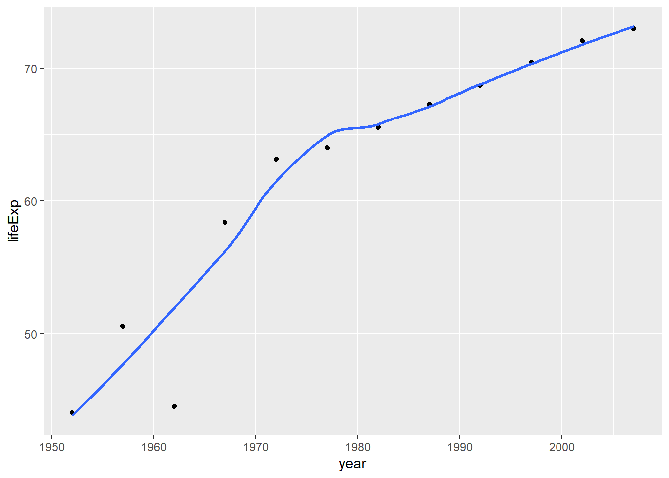
First is a plot of life expectancy over time for the single country I chose, which is China.
plot1 <- ggplot(data = country_data, mapping = aes(x = year, y = lifeExp))+
 geom_point() +
 geom_smooth(se = FALSE) + NULL

plot1
## `geom_smooth()` using method = 'loess' and formula 'y ~ x'
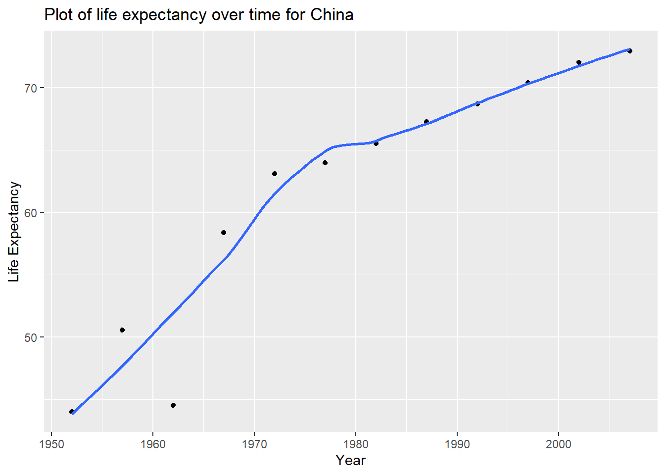
A title added to the plot.
plot1<- plot1 +
 labs(title = "Plot of life expectancy over time for China",
     x = "Year",
     y = "Life Expectancy") + NULL

plot1
## `geom_smooth()` using method = 'loess' and formula 'y ~ x'
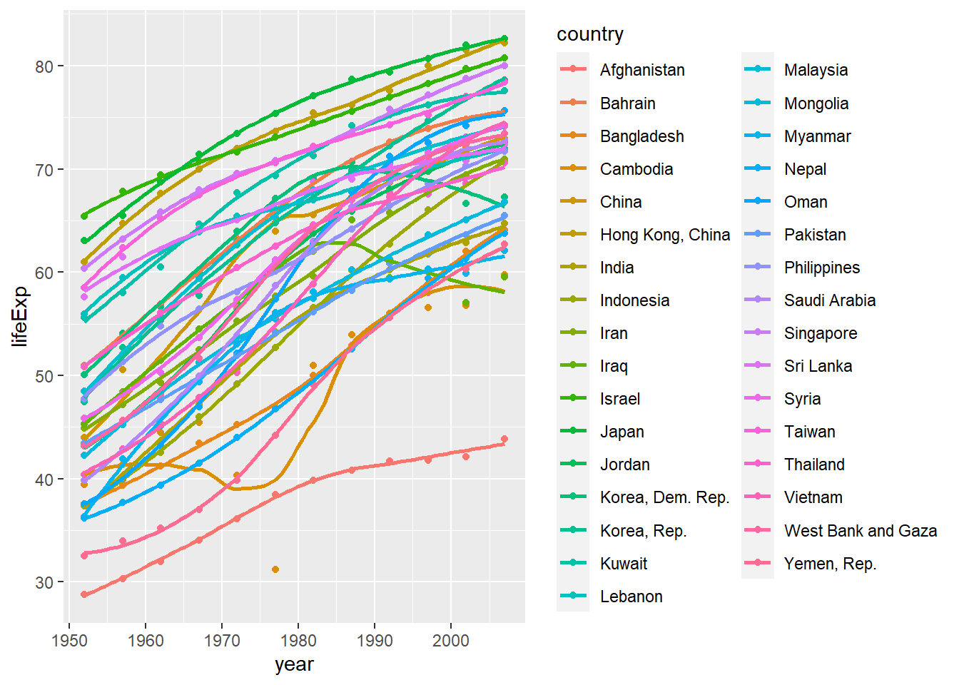
Second is a plot for all countries in the continent I come from, which is Asia.
ggplot(continent_data, mapping = aes(x = year, y = lifeExp, colour= country, group =country))+
 geom_point() +
 geom_smooth(se = FALSE) + NULL
## `geom_smooth()` using method = 'loess' and formula 'y ~ x'
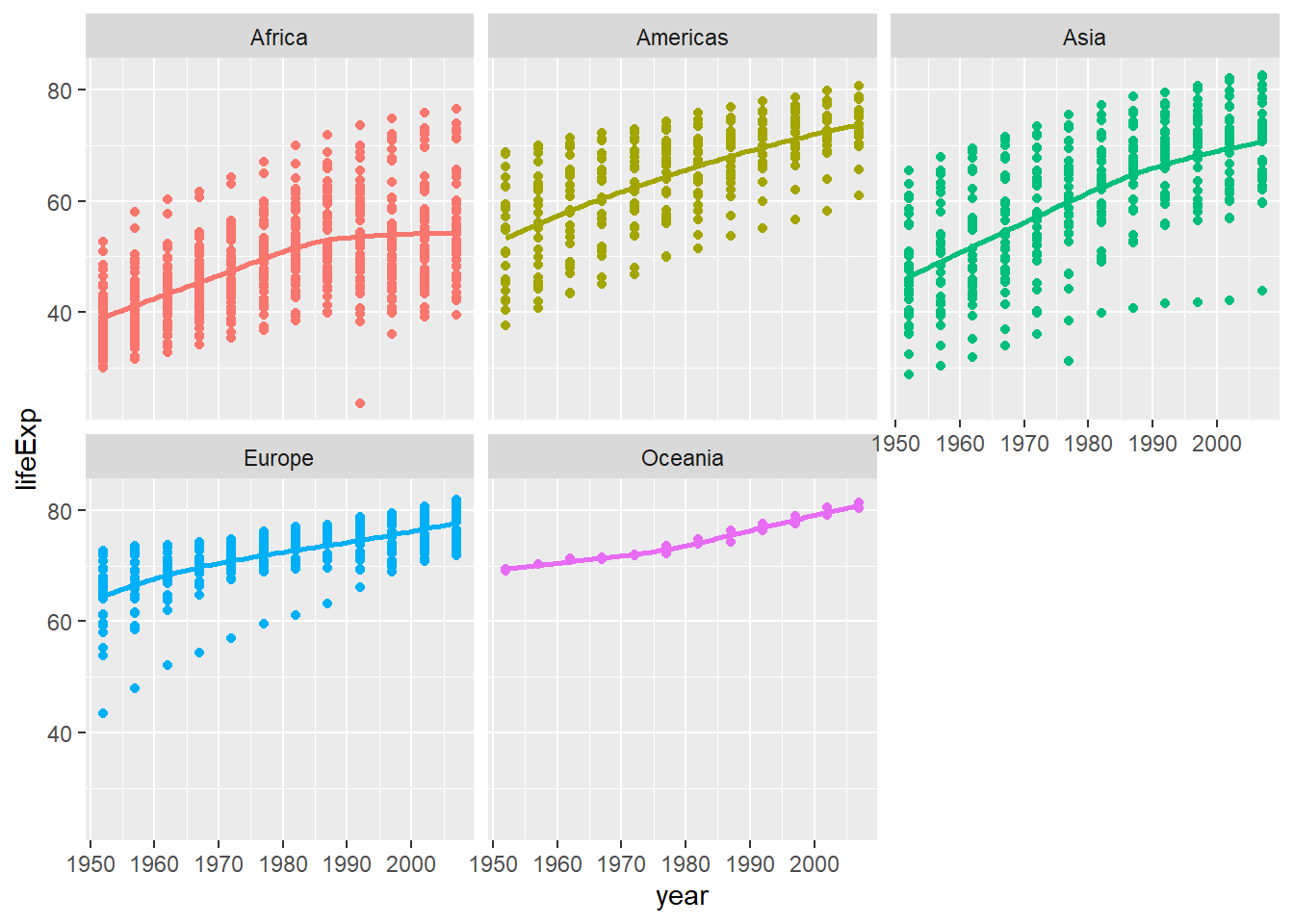
The final analysis explores life expectancy over time for different continents.
ggplot(data = gapminder , mapping = aes(x = year, y = lifeExp, colour= continent))+
  geom_point() +
  geom_smooth(se = FALSE) +
  facet_wrap(~continent) +
  theme(legend.position="none") + #remove all legends
  NULL
## `geom_smooth()` using method = 'loess' and formula 'y ~ x'
Conclusions about life expectancy since 1952:
In terms of trends, since 1952, there have been quicker increases in life expectancies of American and Asian countries, while this growth appears to be slower in Europe and Oceania. Life expectancies seem to have stayed unchanged since 1990 in Africa.
When it comes to country distributions, life expectancies of different countries in Americas, Europe and Oceania are more similar to each other, while those of African and Aisan countries disperse.
Wrong content? Edit on Github.

💬 Comment: